Crafting a Scalable Design System for a Tech Accessories Company
MiLi
Overview
Problem
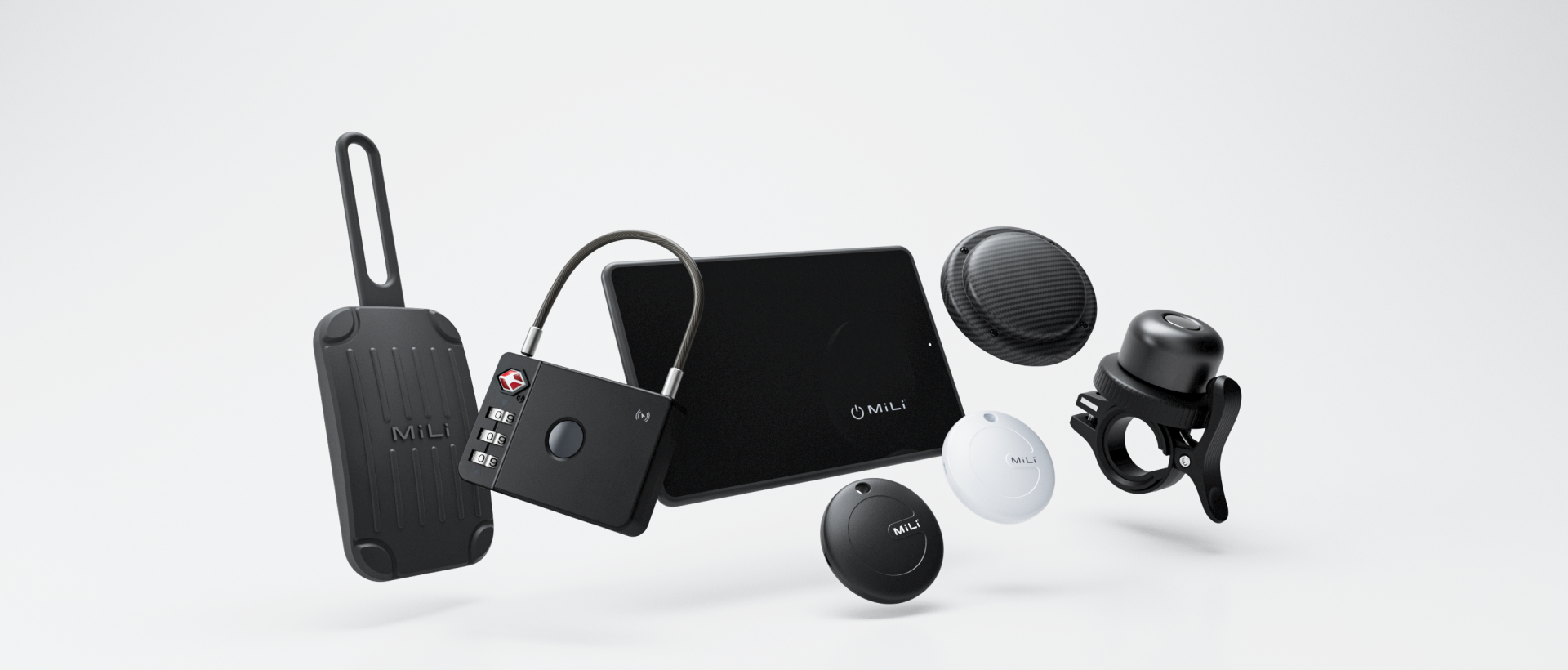
MiLi, a e-commerce brand specializing in tech accessories like bluetooth tracking tags, cards, TSA Locks, and gadgets, came to us with a problem. Despite offering innovative products, their digital presence struggled to deliver a consistent and seamless experience for users. They faced issues with accessibility, fragmented visual elements, and confusing navigation across their Shopify website and standalone landing pages. As MiLi expanded its product line, these challenges only grew more pronounced.
Objective
To address these challenges, a design system was developed to ensure consistency, scalability, and improved usability, focusing particularly on icons and navigation structure—two critical pain points identified during usability testing.
Project Type
Design System
Duration
10 weeks (September 2024 - November 2024)
My Roles
UI Design
User Research
There were total 3 people working on this project. Aside from me, 1 developer and 1 UI designer.
Challenges
-
Brand Diversity and Product Range
The product lineup includes a variety of use cases (e.g., travel, sports, business), which requires a modular and flexible approach.

-
Inconsistent Visual Elements
The existing site lacked a cohesive style, with mismatched iconography, typography, and colors that diluted the brand’s identity.

-
Scalability for Growth
MiLi’s expanding product line demanded a system that could easily adapt to new categories and campaigns without significant redesign.

Defining the Vision
Our goal was clear: create a design system that was modular, accessible, and scalable. But achieving this meant overcoming the challenges of integrating new design principles into both Shopify and the landing pages while aligning with MiLi’s business goals.
The Process
Foundations: Establishing Categories
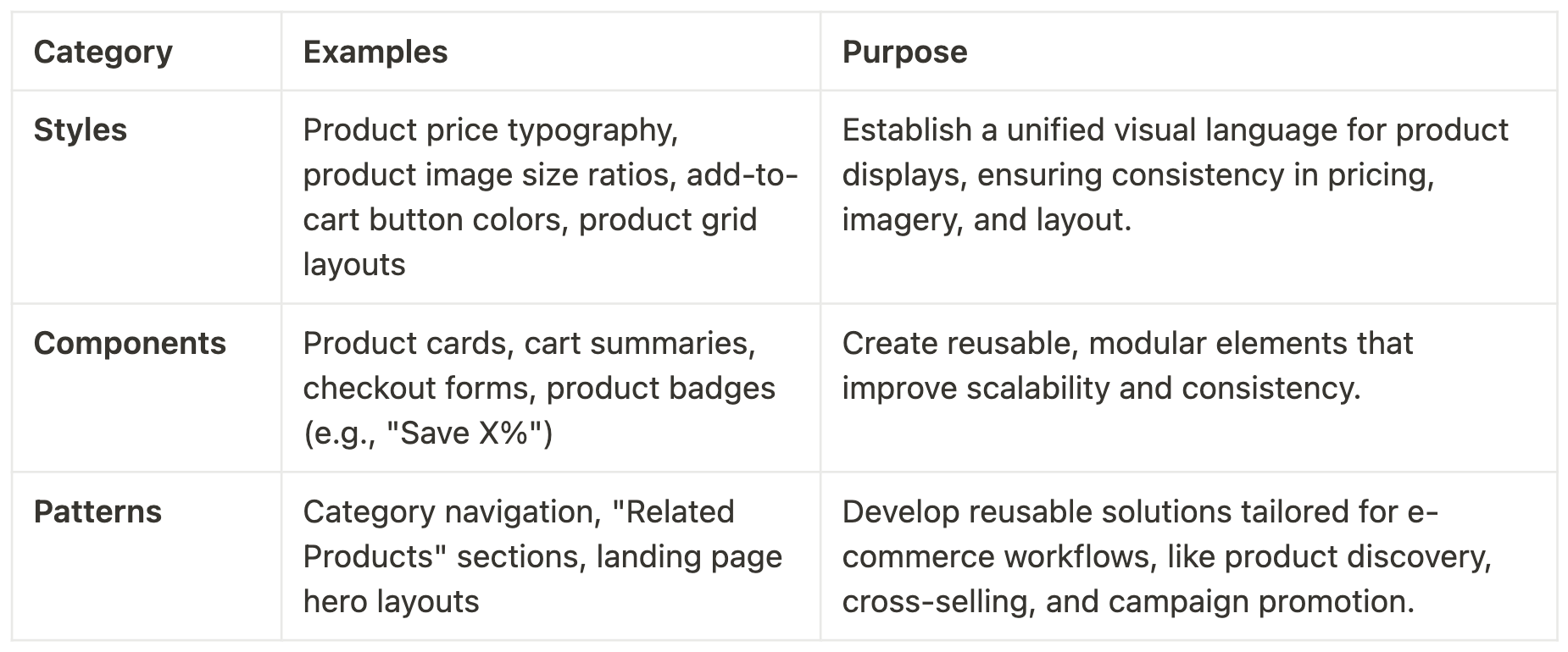
To ensure scalability and organization, we categorized the design system into three main areas:
2. Styles: Establishing the Visual Language
We began by defining the foundational styles to ensure consistency across all digital touchpoints:
Typography:
Selected modern, legible fonts to convey a tech-forward aesthetic while maintaining readability.
Defined a clear hierarchy with size, weight, and spacing guidelines.
Color Palette:
Developed a core palette with high-contrast colors for accessibility, supplemented by accent colors to highlight key actions and features.
Accessibility Focus: Ensured the palette adhered to WCAG 2.1 contrast ratios for text, buttons, and key visual elements.
Spacing and Grid System:
Established consistent spacing rules and a responsive grid to ensure layouts felt balanced and scalable across devices.
Design Tokens:
Introduced reusable design tokens to standardize colors, typography, and spacing across all components.
Examples of Primitive Tokens:
color/blue-700:#004FB8spacing/medium:16pxfont/size-large:24px
Examples of Semantic Tokens:
button/primary-bg:color/blue-500card-padding:spacing/mediumheading-size:font/size-large
Tokens acted as the single source of truth, ensuring seamless updates and consistency across the entire design system.
3. Components: Building Reusable Elements
Icons:
Created a library of medium-weight, high-contrast icons to improve readability and usability.
Differentiated interactive and static icons with hover states and visual cues.
Buttons and CTAs:
Standardized primary and secondary buttons with clear hover and pressed states for improved interactivity.
Product Cards:
Designed modular product cards adaptable to various product categories, from MiTags to TSA Locks.
Forms:
Developed accessible, user-friendly form elements for checkout, signups, and inquiries.
4. Patterns: Creating Scalable Solutions
Navigation Framework:
We then tested with users and streamlined navigation by consolidating "Shop" and "Collections" into a single “Shop All” menu with subcategories for "Shop by Use Case" and "Shop by Products"
Introduced a responsive mega menu with visual previews to simplify browsing.
Content Layouts:
Designed flexible page templates for product showcases, landing pages, and campaigns to ensure brand consistency.
Tokens were used to standardize margins, typography, and background colors across templates.
Landing Page Integration:
Created modular components and templates specifically for marketing landing pages, ensuring they aligned visually and functionally with the main Shopify site.
Allowed the marketing team to quickly build new pages without sacrificing consistency.
Before
After
Documenting and Communicating the System
To ensure seamless adoption by the engineering team, we prioritized clear documentation:
Component Documentation:
Each component was accompanied by real-world usage instructions and examples.
Figma files included clear naming conventions and explanations of component properties (e.g., booleans, variants, and states).
Integration Guidelines:
Provided CSS snippets and design tokens for developers to implement styles directly into the codebase.
Included responsive behavior documentation for components to ensure seamless performance across devices.
Collaboration Tools:
Used Figma’s built-in commenting and prototyping features to streamline communication between designers and developers.
Hosted regular design-engineering syncs to address questions and ensure alignment.
Overcoming Challenges Along the Way
Building the design system wasn’t without hurdles:
Balancing Flexibility and Consistency:
Striking the right balance between modularity for future growth and maintaining a cohesive brand identity required ongoing collaboration between designers and stakeholders.
Navigating Shopify’s Framework:
Customizing the site within Shopify’s constraints meant finding creative workarounds, such as leveraging reusable design tokens and Liquid logic.
Aligning Landing Pages with the Main Site:
Ensuring that standalone landing pages felt integrated with the main site required careful planning of shared components and styles.
Lessons Learned
Start with the User:
Usability testing and feedback were critical in shaping the design system to meet real needs.
Iterate, Iterate, Iterate:
Regular testing and revisions ensured the system was both robust and flexible.
Design for the Future:
Building with scalability in mind saved time and resources as MiLi’s product lineup expanded.
The Power of Tokens:
Design tokens streamlined the implementation process, ensuring consistency and simplifying future updates.
Integrated Marketing Tools:
Aligning landing pages with the main design system ensured a cohesive brand experience while empowering the marketing team.
Documentation is Key:
Detailed component documentation with real-world usage examples and CSS snippets bridged the gap between design and development.
Conclusion
The scalable design system developed for MiLi transformed their e-commerce experience, creating a unified, accessible, and future-ready platform. By focusing on user needs, aligning marketing and product experiences, leveraging design tokens, and providing clear documentation, the system not only resolved existing issues but also laid the groundwork for sustained growth and innovation.


