ISOASIS
An Oasis in Isolation
Overview
Problem
“There is compelling evidence for adverse mental health effects of isolation and quarantine, in particular depression, anxiety, stress-related disorders, and anger..”
European Archives of Psychiatry and Clinical Neuroscience
Quarantine is one of the main strategies for protecting the public by preventing the spread of Covid-19 in many countries. However, many people who have undergone quarantine reported having negative psychological impacts.
Objective
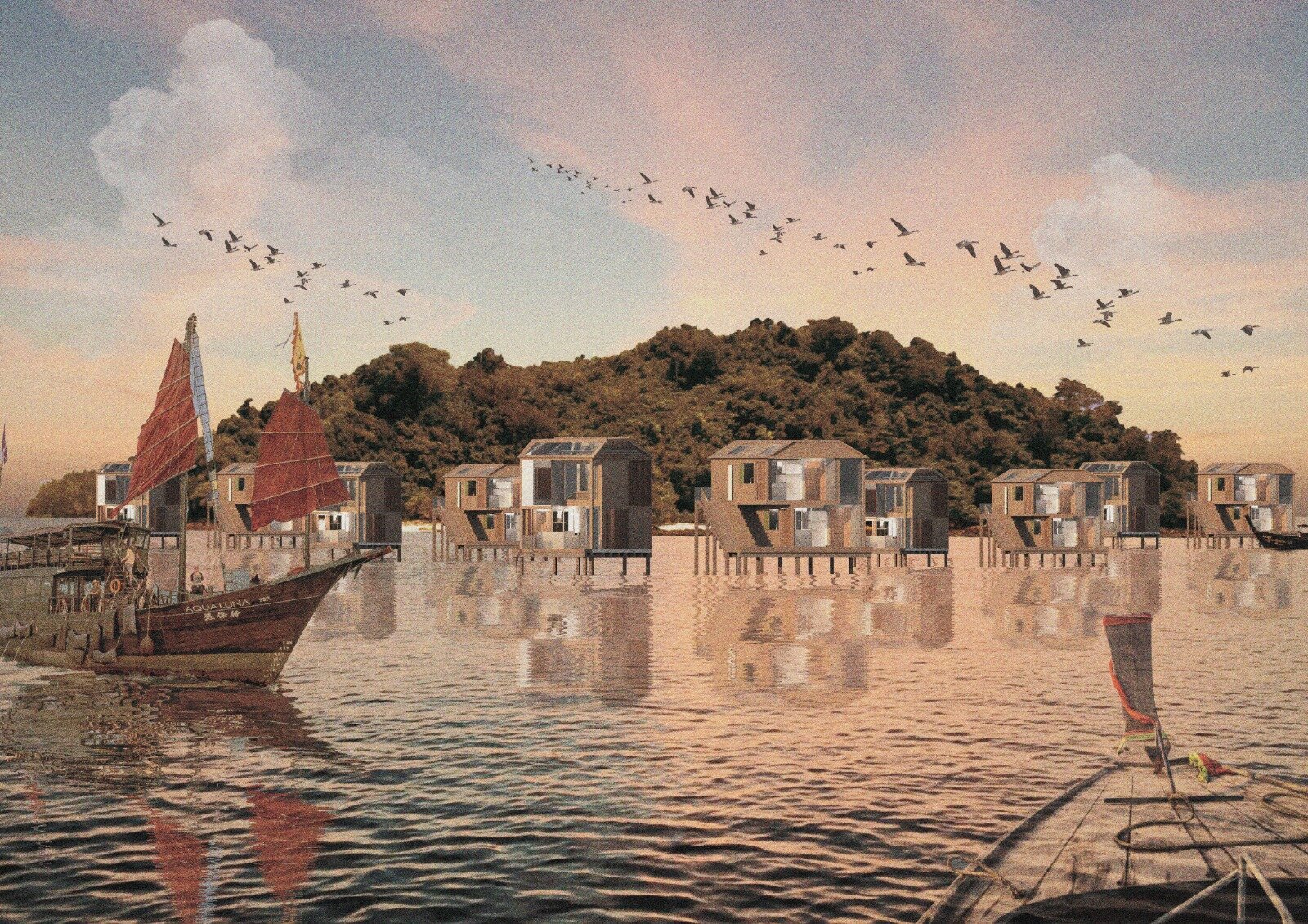
The goal of this project is to create a holistic and user-centered quarantine service experience—designed based beyond the physical needs and focuses on users’ mental health.
Project Type
Service design, UI UX design
Duration
10 weeks (June 2020 - March 2021)
My Roles
Product design
Branding
There were total 4 people working on this project. 1 industrial designer, and 2 interior designers
Timeline and Framwork
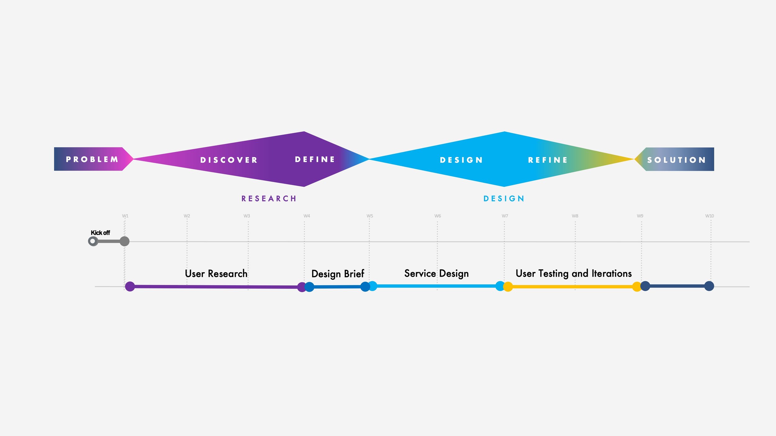
I. Discover
We first conducted online surveys and focus groups.
Through online surveys and focus groups with people who have experienced quarantine, we were able to gather both quantitative and qualitative insights, which are used to form hypotheses for our design solution to be tested later.
78 people responded to the questionnaire, and the data was used to set criteria to recruit and conduct two rounds of focus groups consists of 4 people.
Takeaway 1
People care about food the most
Most people in quarantine consider food service to be the most important part of the experience, followed by recreational activities, interior and environment, and stable internet. Focus group participants suggested that they missed home cooking during quarantine, and takeouts are not able to satisfy them emotionally the way home cooking does.
Other factors that concern quarantine users are: location, view, neighbors, and staff attitude.
Takeaway 2
Business travelers struggle with a lack of motivation
Most people who travel during the pandemic are due to business reasons. In the focus group, we invited 3 business travelers (2 traveled for personal/ family reasons) who reported that one of the biggest stress factors is not being able to maintain their health routine (healthy eating and working out) during quarantine on top of working in the hotel.
Going into the research, our initial understanding was that social isolation would be the biggest struggle that people have, but the focus group discussion revealed that people actually struggle the most with a lack of motivation. The participants said that it is because they feel like there is nothing to do in a confined space other than spending time in the digital space or working.
Takeaway 3
Bad lighting makes people feel worse
While it is generally not a problem for luxurious hotel rooms, those who cannot afford one reported in the focus group that bad lighting and lack of sunlight make them feel worse. With limited space and budget, we want to explore ways to enhance the indoor experience.
We then created our personas based on the data gathered from user research
ISOASIS's main target user is inbound travelers who have to mandatory travel, whether it is for work or personal reasons.
After conducting user research, I created 2 user personas in order to reflect the main concerns that the users encountered during the quarantine process and help define the target user groups.
II. Define
Affinity Mapping
After gathering responses from the questionnaire and feedbacks from the focus group discussion, we did an affinity mapping session with internally with the team to explore more ideas.
Our Product Vision
Food Service
Our research revealed food to be the most important factor in the quarantine experience. Hence, the product aims to support users both nutritionally and mentally.
Indoor Activities
Our research suggested that people tend to halt their fitness routine once entered quarantine. The product aims to guide and support users to enable them to continue or start new physical and mental goals despite the constraints that come with quarantine.
Smart Environment
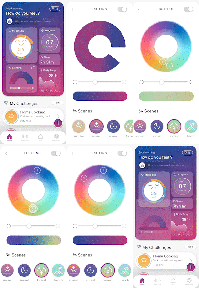
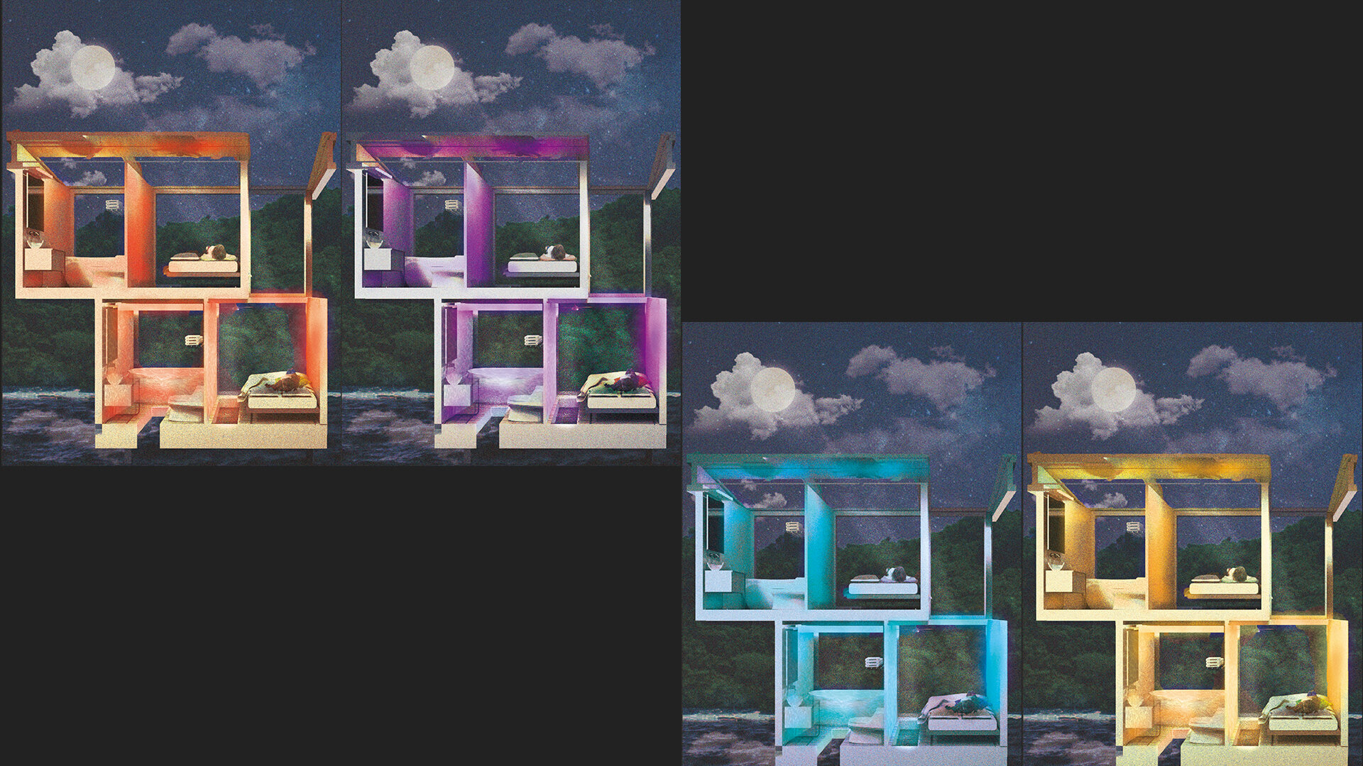
Coloured lighting can influence the emotional states of the people inside a space [1]. We want to integrate and explore the feature that allows users to change the lighting colors of the interior space to create a holistic experience.
Benchmarking
We looked at different wellness apps to see what they are doing well as the foundation of how we can integrate different features into one design.
Takeaways
While there are existing apps in the market that cater to specific wellness areas, these apps do not take an integrated holistic approach to improving mental health
There was also no existing app focusing on mental wellbeing during quarantine
III. Design
Sketches and Exploration
I first sketched out some potential solutions for the biggest challenge and objective of the application—encouraging users to achieve their personal goals and manage mental wellness during quarantine. I used the hook model and the Fogg Behavior Model to develop a design that encourages healthy living with the consideration for the constraints that come with quarantining.
To encourage healthy lifestyle during quarantine:
Trigger: achieve personal wellness goals (internal); activity cards and progress bars (external)
Action: simplification of activities through easy-to-follow tutorials
Variable Reward: progress bar, completion badges, and leaderboard to encourage users to keep up with completing their goals
Investment: users complete their personal goals and invite friends to join the challenges
I then explored different versions of this design and came up with different design to be compared and evaluated. Specifically, I was looking for well defined visual hierarchy and the design’s ability to present all the necessary elements. I considered the different ways to prioritize certain tasks that are really important to users. For example, when users first arrive at the app, they should first see the status of their progress in the quarantine. I explored design with the modular-style of dashboard in mind by allowing users to look at their status and progress on one screen.
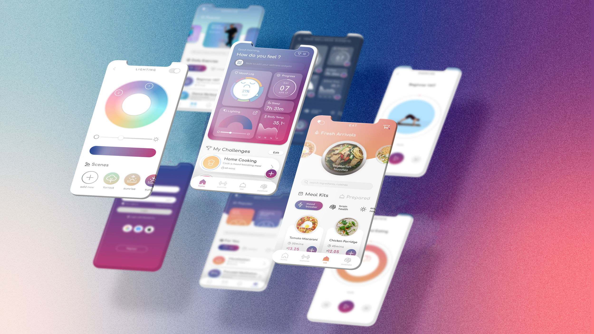
I explored using different UI systems and in the end, I selected the one with the most potential to work with— using widgets to display personal progress and status of different wellness areas (a wellness dashboard), and cards for physical and mental challenges users can pick to complete.
Medium-fidelity Wireframe
Information Architecture
I then created the navigation scheme outlining the structure of the product. The diagram helps to figure out which options the users can choose, and helps to define navigation and hierarchies within. I considered the different ways to prioritize certain tasks that are really important to users. For example, the lighting control should be placed in the dashboard where it can be easily accessed by the users.
Color Study
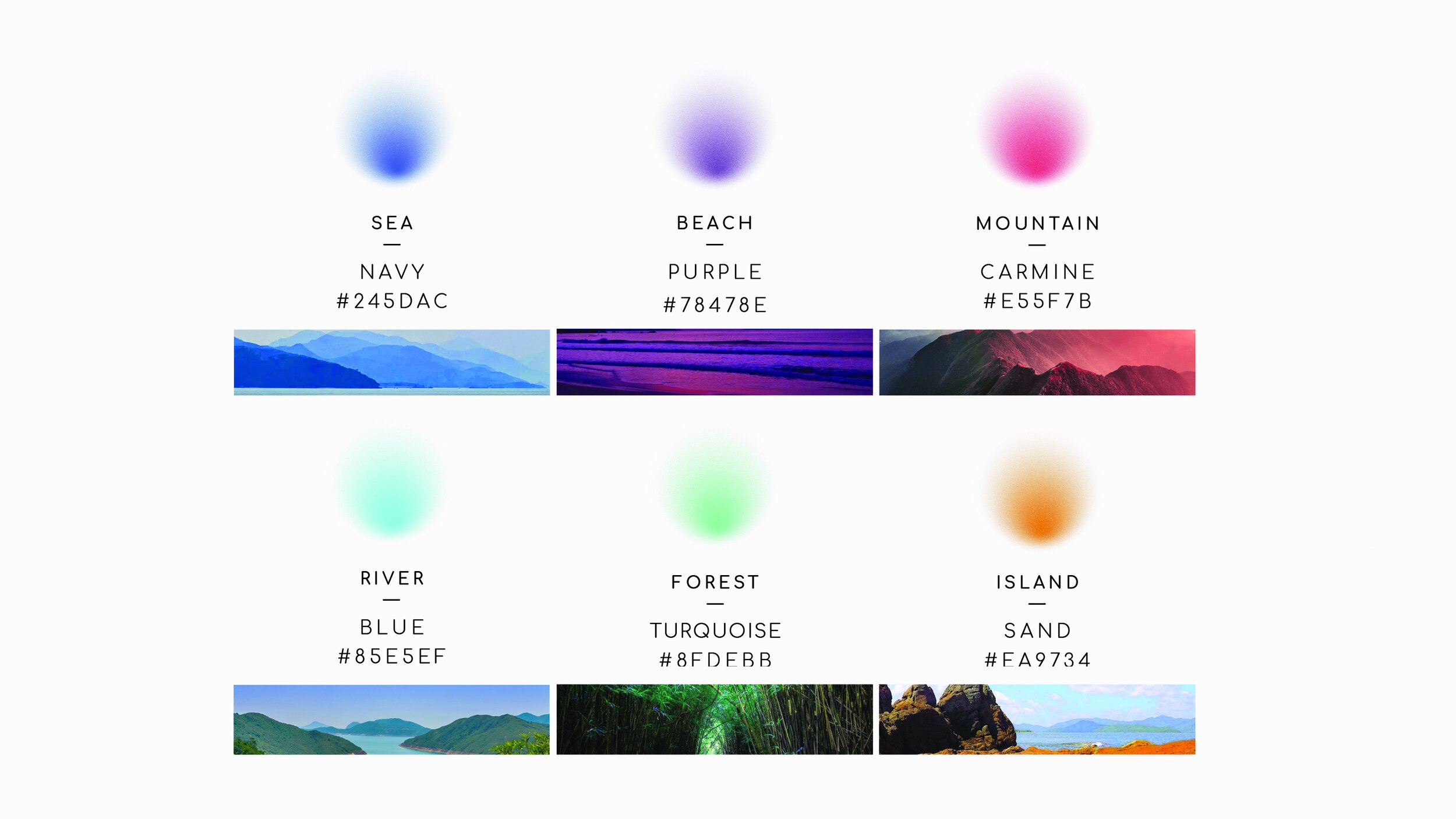
We invited 5 participants who match with our persona type to be in a dark room with the architectural model with lighting to simulate the interior environment of the designed space. We then recorded how emotions are connoted with the specific colors.
-
Red
Excitement and strength
-
Yellow
Warmth and creativity
-
Green
Nature and healing
-
Blue
Peace and calmness
-
Purple
Meditation and relexation
-
Pink
Soft and nurture
Story boarding
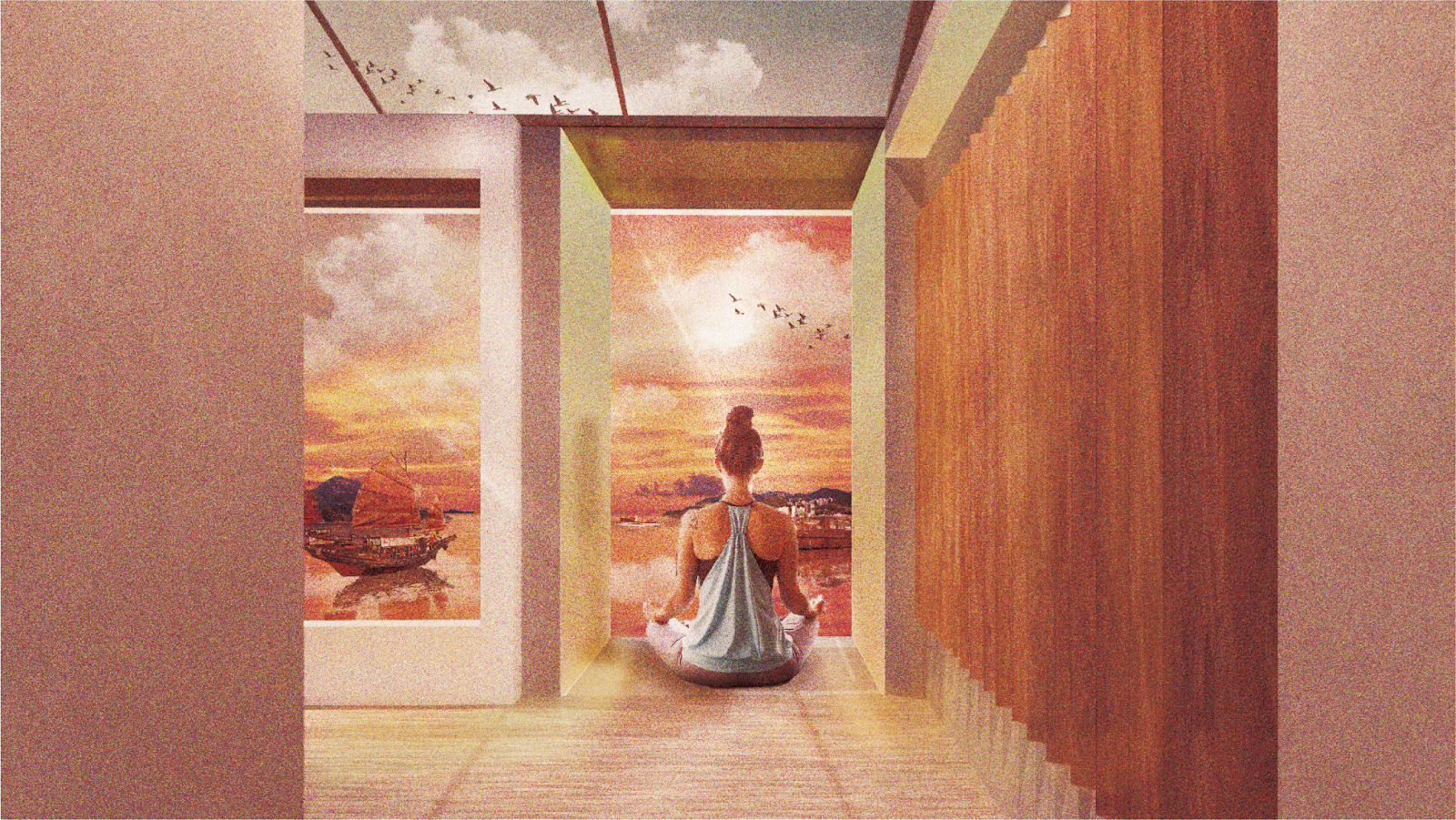
Since different design disciplines are involved in the process, I created a storyboard depicting the entire service system from the users’ perspective to ensure that all parties understand how the different systems contribute to the overall experience of the users.
UI Design
I designed the UI based on how users responded to the color study, and used colors that are tranquillizing and calming. This color palette also became part of the identity of the application. All the other UI elements are created with the objective to not only be clear and identifiable, but also a soothing experience for the users. For example, rounded and natural elements.

IV. Refine
Usability Testing & Main Iterations
Created a clickable prototype on Figma to conduct a usability test with 5 users. I gave users scenarios based on the core features that I wanted to test, and documented the pain points and comments in their user flows.
1a. From Generalization to Customization
4 out of 5 users reported wanting to improve different aspects to better their mental wellbeing. Hence, I explored changing the dashboard from generalized content including duration progress, lighting control, mood, sleep, and temperature, to a customized dashboard to fit users’ needs seamlessly based on their lifestyle and routine.
1b. Integrate Visual Metaphors
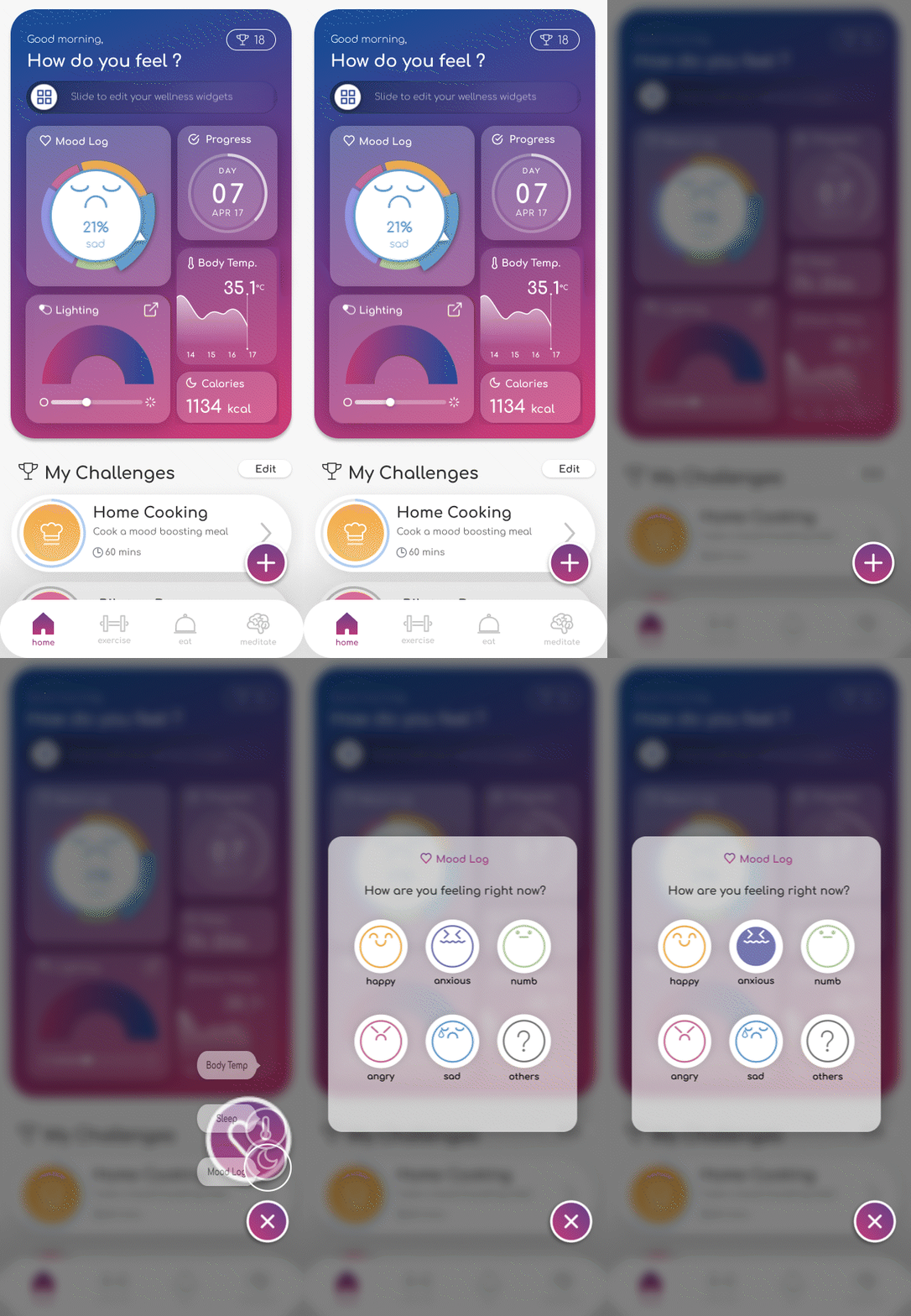
3 out of 5 users reported feeling confused about how to interact with the mood log widget. I have iterated the presentation method by incorporating metaphor associated with turning a steering wheel to guide users to rotate with the bezel intuitively.
Before
After
2. Provide both “Freedom” and “Options”
3 out of 5 users reported being unsure about what colors to pick. Therefore. I have iterated the design to provide suggestions and short-cuts to picking colors that are best fitted for the users depending on their mood.
Before
After
3. Increasing UI Contrast for Accessibility
2 out of 5 users mentioned that the gradient buttons are hard to read. Functionality and accessibility should not sacrifice accessibility. I adjusted the color to increase contrast between the texts and the background. I used the Figma plugin (Able by Sondre Kvam) to make sure that the rest of the design meets WCAG standards.
Before
After

Home & Wellness Dashboard
The wellness dashboard visualize progress and status of different wellness-related users. Users can customize their dashboard based on topics that they care about. They can also customize the environment with the lighting control from the dashboard.
○ Lighting control and scene options
○ Customization based on users’ preference
○ Challenges of differnt indoor activities
Food Service
Food service is one of the core features of the app. It aims promote healthy eating and provides users the option to cook on their own to improve user’s mental wellbeing.
○ Categories based on user’s mood
○ Options for meal kits and prepared meals
○ Step-by-step cooking tutorial videos
Indoor Activities
Experience
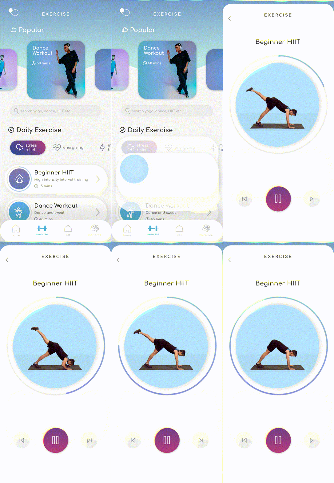
○ Categories based on user’s mood or mental effects
○ Meditation and indoor exercises
○ Step-by-step exercise tutorial videos
Post-project Reflection
This is the first project where I worked as the only product designer on the team. The app design is part of a bigger service design project (including the interior and environment design and industrial design). As a junior product designer, this is an incredibly valuable experience where I was able to develop both hard and soft skills.
Be realistic with project scope
While this case study highlighted my main role (product designer) in this service design project, the scope of the project also consists of other components that are simply too large and ambitious to be tackled in a short amount of time. I wish that there was more time for more rounds of user testing and iterations. I learned from this experience that it is important to be realistic with the project scope with the consideration for time and resource available.
UX principles are not limited to the digital space
Doing a service design project has taught me that UX principles and heuristics can be applied to service design as well. User-centricity sits in the core of both design disciplines, and they hold an interconnected relationship. For example, being transparent with the state of the user is not only about showing where they are in the app in this project, it’s also about making them aware of where they are in the process of quarantining.
Validating and iterating should be done as early as possible
In the beginning we have spent a lot of time on designing details only to find out that the design do not work at all. For instance, I designed jumped from sketches to medium wireframe and UI design only to learn from user testing that the user flow from dashboard to customization feature is not intuitive and have to do more to revise the previous steps. To work more efficiently and avoid wasting efforts and time on creating designs with problems, I learned to constantly validate the design through a repeated process of user testing and iterating in the beginning stage.
Press Release
https://www.dezeen.com/2021/07/27/the-hong-kong-polytechnic-universitys-student-design-projects-school-shows/
References
Henssler, J., Stock, F., van Bohemen, J., Walter, H., Heinz, A., & Brandt, L. (2021). Mental health effects of infection containment strategies: quarantine and isolation—a systematic review and meta-analysis. European Archives of Psychiatry and Clinical Neuroscience, 271(2), 223-234. Utter, J., Denny, S., Lucassen, M., & Dyson, B. (2016).
Adolescent cooking abilities and behaviors: Associations with nutrition and emotional well-being. Journal of nutrition education and behavior, 48(1), 35-41.


