AR Travel Kit
Wayfinding Experience Design
Project Type
Conceptual product design
Duration
6 weeks (June 2020 - March 2021)
Roles
User experience research (my role)
Visual design (my role)
AR developer
Publication design
There were total 4 people working on this project
Overview
Problem
How might we turn an off-the-map food hub into an accessible spot for non-local people to experience the unique food culture offered?
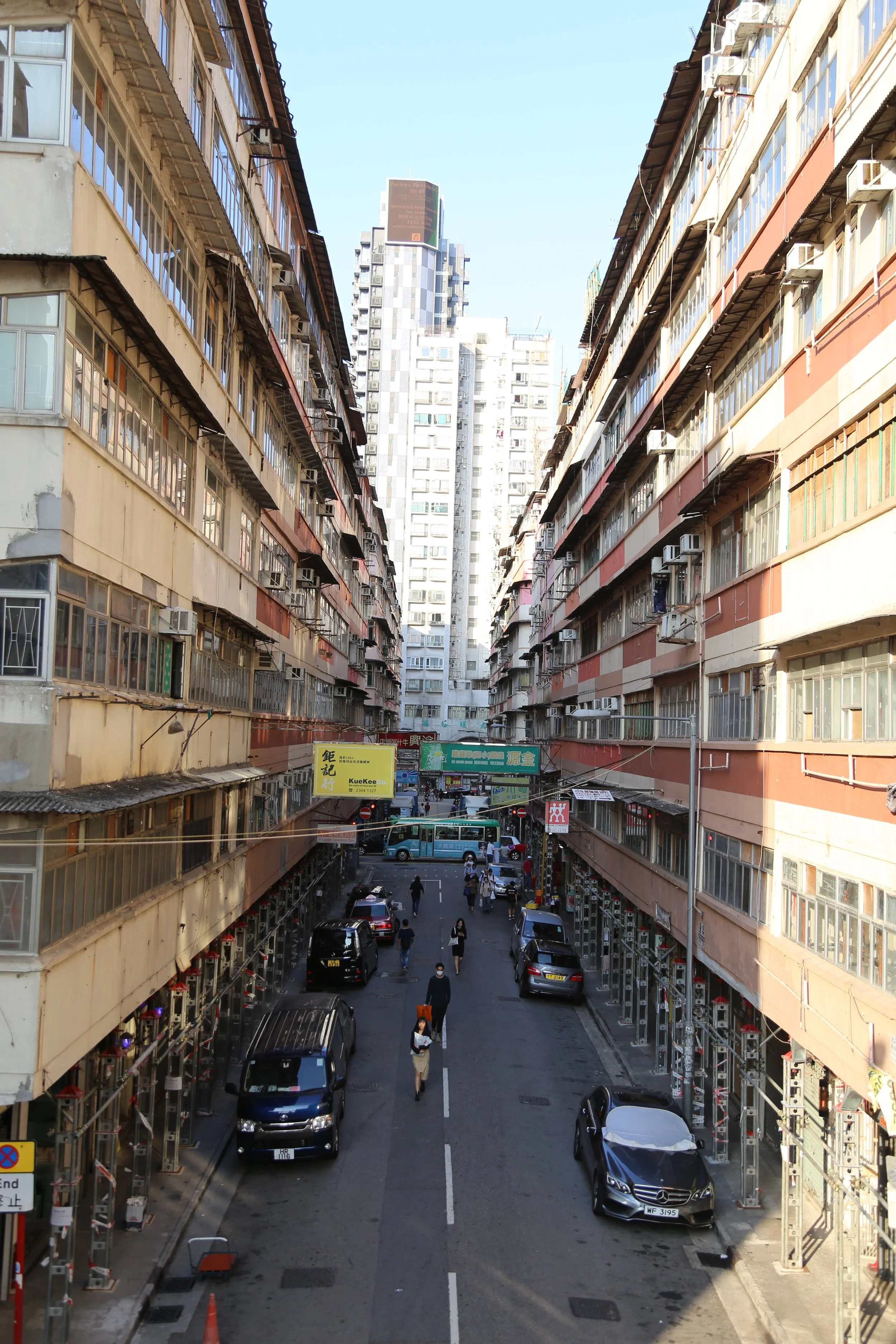
Hong Kong is a unique city that offers a juxtaposition between tradition and innovation, history and modernization. With such a melting pot of different cultures, the city equally offers a unique and rich food culture. One of the many food districts in Hong Kong is the Whampoa area—with a flourishing local hub filled with delicious local eateries and colourful culture. However, the problem with these local eateries is that they remain relatively unknown to many non-locals in Hong Kong. In addition, these eateries are not accommodating to non-Cantonese speaking customers to the heavy Cantonese speaking environment and minimal use and written English in these eateries.
Objective
The aim of this project is to offer guided tours and information focusing on the eateries offered in Whampoa, supplied with supporting recreational activities offered there. Thus, bringing a more local and authentic experience to the non-local residents and tourists of Hong Kong.
-

Empathize
We employed several different ethnographic research methods to gather data and information about our users, including AEIOU; a Questionnaire; Stakeholder Interviews; Persona Profiles; Empathy Maps; and a User Flow Scenario
-
Define
What should we know about the services you provide? Better descriptions result in more sales.
-
Ideate
What should we know about the services you provide? Better descriptions result in more sales.
-

Prototype
What should we know about the services you provide? Better descriptions result in more sales.
-
Test
Description goes here
Empathize
The Problem
On a Friday morning after a project meeting, some of the classmates suggested to have a group lunch together. A few local students wanted to bring us to the Whampoa area where affordable and high quality restaurants can be found there. Since there were 9 of us, we split into smaller groups and went to find a restaurant on our separate ways to cover more locations.
It took us nearly an hour to all sat down at the table of a dim sum restaurant. During our lunch, we began to talk about the small adventures we encountered—some pleasant, some not very. Our international classmates especially struggled, complaining about how hard it was to navigate through the area.
We realized then that we took the culture and language that we are so familiar for granted. Since the area is not tourist-friendly , some of the eateries are not even mapped on Google Maps, and information online is very limited, it was no wonder that the non-locals find it so difficult to find a restaurant.
They enjoyed the food very much. It is a pity that they have just discovered this gem near the campus, but are still unable to experience the food culture like how easy it is for the locals.
My group and I began to talk about creating a design that can help them to not only find these eateries, but to have an enjoyable experience while doing so—turning the food culture into an accessible experience for non-local people for a design assignment.
Ethnographic Research
We kicked off our ethnographic research with a scoring system questionnaire and distributed it through Google forms. The objective is to prove (and disprove) some existing hypotheses we had. 79 people responded (most are from our school).
We then conducted AEIOU observations around the Whampoa region. This framework helps us to organize our observation during the field study and to generate insights as a team later on in the process.
To understand the “why” behind some of the results received in the questionnaire, we also conducted 5 interviews with people that would fit our targeted users— tourists (x2), international (x2) and exchange students (x1). Our guidelines for the interview questions were divided up into 3 sections: demographic, targeted, and user motivation.
Takeaway 1: Confusing Signage and Directories
More than 65% of respondents think there is not enough instruction to guide them in the Whampoa area and 77% of them consider the streets to be confusing to navigate around. Interviwees further elaborated that there is a lack of signage to eateries (only street names). They also thought that the streets are narrow and stores are obscure. That means we may need to consider the alternative ways of providing more instructions to different corners.
Takeaway 2: Fear of the Unknown
77% of participants rated a “5” or below, indicating that most of them have some sort of fear going to an unknown destination they are not familiar with. To solve this issue—we can include more photos, make the map more detailed, in order to have the users become more knowledgeable about Whampoa before having even visited. Therefore, they will not have a fear in exploring the area. A well detailed map and guide may contribute to the popularity of exploring Whampoa as a tourist or getaway spot.
Takeaway 3: Unrecognized Landmarks
55% of participants gave a “4” or below—stating that most of them rely on landmarks to determine the direction. As the streets in Whampoa are confusing, we may need to mark down different landmarks for users, to help them orient themselves around different restaurants and areas. Being a residential area, many building look too similar to be distinguished apart.
User Persona
To understand who we are designing for and the users’ wants and needs, we created personas and user scenarios to snapshot the emotions during their interaction with discovering eateries to provide further insight into their emotions and thoughts based on the questionnaire and interview results.
Define
Our problem statements…
With the quantitative and qualitative data gathered, we then created an aggregated empathy map that summarizes the findings from the research and to communicate and align our understanding as a group.
At this point, we knew what caused the painpoint (i.e. confusing signature, unfamiliarity, and unrecognized landmarks). Hence, we could proceed with defining our problem statements and use them to guide our team through the design process. We included sub problem statements to narrow down our UX purpose and direction:
How might we turn an off-the-map food hub into an accessible spot for non-local people to experience the unique food culture offered?
How might we create an enjoyable way-finding experience through experience design? What do the users need in their journey to minimize the painpoints?
How is the experience between locals and non-local people different?
Ideate
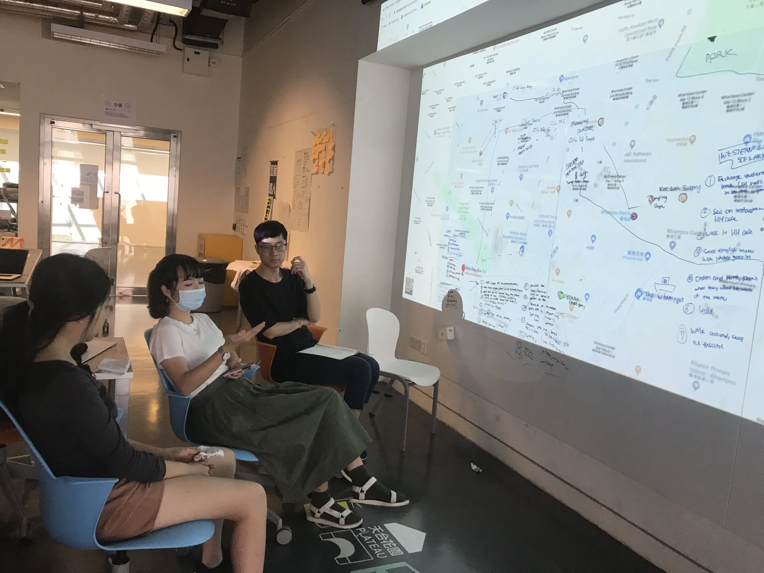
To analyze qualitative data and observations, we then organized information into groups of similar items. Through affinity mapping, we were able to see the information we gathered through new lights, and helped build unexpected connections.
In our “incentive” category for example, we discover that the most important consideration points for our users when choosing a restaurant are:
Dietary Restrictions
Experience (E.g. Environment, Activities)
Good Value
Service (I.e. Friendly, Quality)
Food
Convenience
From here, we learnt that culture can affect user experience not just in terms of language barriers (e.g. menus reading, communicating with staffs), but dietary restrictions (e.g. Hindu vegetarianism is a dietary practice in India and about 25% to 35% of the population is vegetarian), and unlike local users—international students, exchange students, and tourists see experience as an important incentive since they tend to want to experience something special and interesting with their limited time stay.
Affinity Mapping
We explored ideas like an app, a website, and installing signages. Considering budget, timeline, and feasibility , we dropped some ideas and decided to create a travel kit for users that will include:
Map: for way-finding tool that guide users without the confusing signage
Booklet: to minimize the fear of the unknown by show images giving users a sense of familiarity before going
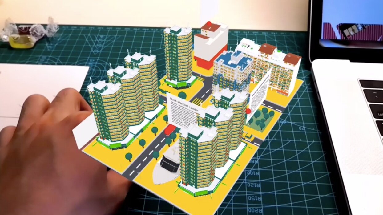
AR Postcards: to introduce unrecognizable landmarks in an engaging way
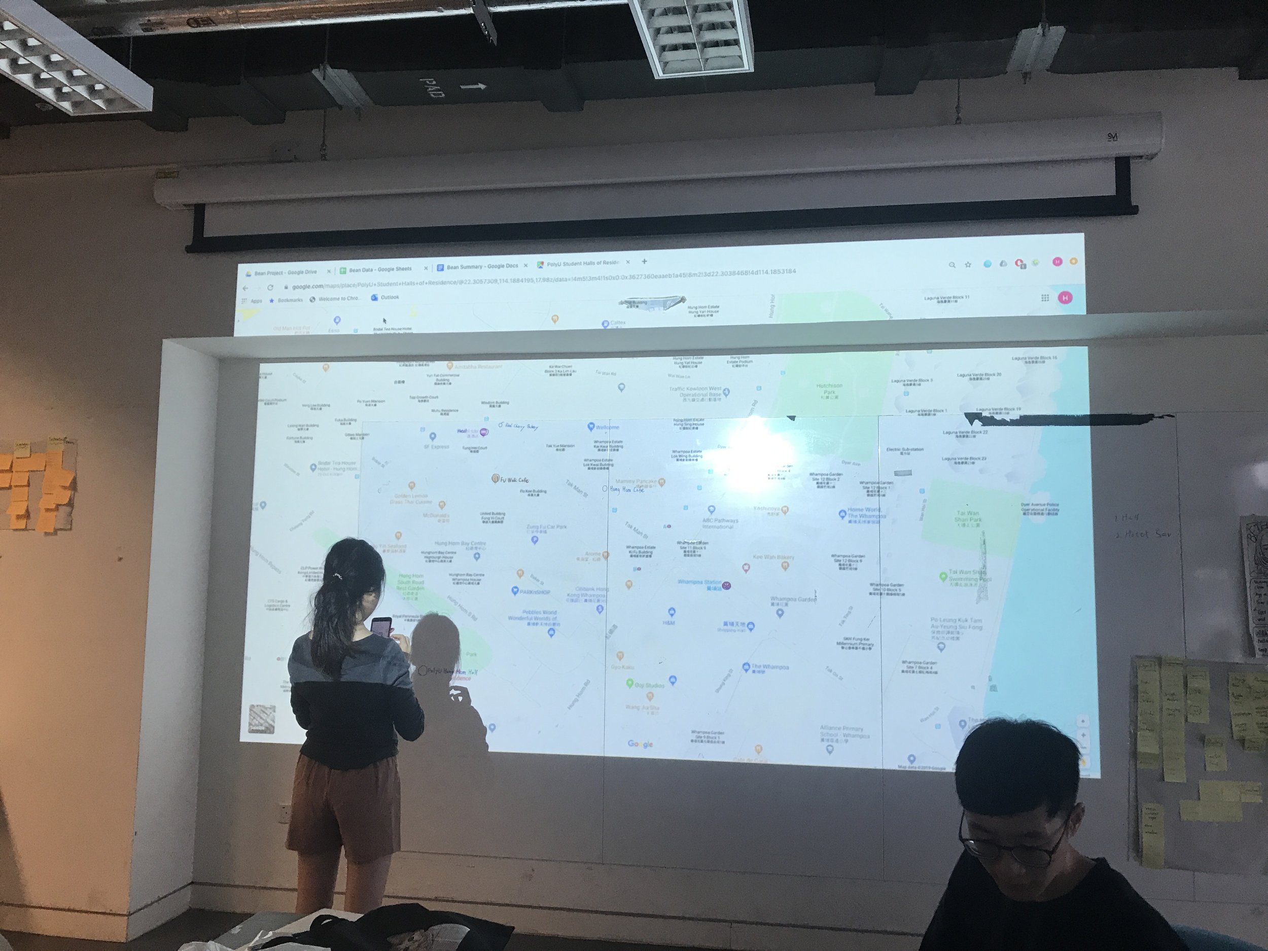
Based on this new concept of creating a full day walking tour of Whampoa, and on our personal profiles we developed—we created three types of routes: fun, cultural, and healthy—for the wayfinding project. As a group we started to plan and note key landmarks in these routes through a more physical method of linking key landmarks together and categorizing them into different routes. By doing this physically on a map also helped us see the proximity of each of these landmarks, aiding in creating a tour experience that is not too tiresome.
Prototype
AB Test
In preparation for the user tests, we developed an initial preliminary prototype to test the general concept of our ideas, and more micro-design decisions such as sizing of the product, color scheme, and typography. Thus, we developed a prototype that did not include all the content in our final deliverable, but areas we could user test to decide early on different micro-design decisions.
Mechanism
The prototype we developed roughly represented the image of the final product we had in mind. All the contents would be carried by a folder, that appeared similar to a book. When the folder is opened, on the left side would a booklet attached to the folder that contained more detailed information regarding the landmarks in the routes, while the right side of the folder had a pocket that would be used to organize and carry different loose items such as the map and postcard.
Way-finding
The main goals for our user tests were to collect qualitative behavioural data and attitudinal feedback on our prototypes— focused in on the aspect of wayfinding. Therefore, we created only blank prototypes of the booklet, folder, and postcard, and created a more detailed prototype of the map. The map would test out some wayfinding elements, along with the colour scheme, text sizes, and general layout of the map. The prototype would also be used to test the actual size of all of these elements, in order to see the general usability of these items.
Test
Part II: Field Test
The second part of the user test was conducted in Whampoa, at the Hung Hom Student Halls. While walking towards there, we asked some brief questions regarding their opinion so far on the system. Once we arrived at the entrance of Hung Hom Halls, we began the field test as the user tries to navigate around the key spots on the chosen route. They were told to interact with the map naturally as possible, and could even stop for a drink/snack in the midst of their route. As testers we are unobtrusive observers, only chiming when necessary.
Part I: Indoor Lab Test
The first part of the user test was a lab test conducted indoors. The user was presented both the book folder and map with no context and explanation, and was asked to explore the products and speak out their minds. After their first impressions, we then described the intention of the items, and asked them more specific questions regarding their behaviour, eg. Why did you read this first? We then asked them a series of targeted questions regarding their preferences on the text and visual information of the map (font, text size, colour). We concluded with any follow up questions that might have been missed or interesting statement that was said by the user.
Part III: Conclusion
For the final part of the user test, we asked any necessary follow-up questions regarding the field test, and concluding the user test with a quick questionnaire regarding the usability of the system. The questionnaire was used again in the second round of user tests as a way to compare scores and see if usability has increased.
Emphasis is more Identifiable than Realism
Most users heavily relied on the illustrations on the back of the map, and used them as reference to discover certain landmark. There were a few instances where users got lost, or arrived in the correct location and did not just realize it. In the follow-up interview, it was revealed that this was because they did not recognize some of the the illustrations of landmarks on the map when the illustrations are monochromatic and photo-traced. Interestingly, inaccurate proportion do not disrupt users from recognizing the location, especially with high color accuracy and emphasized key features of the landmarks. Users also prefer flat over perspective drawings since they tend to identify a building from the front view.
Everything is a part of the experience
We previously focused mainly on determining what locations best fit the users’ needs. However, during our field study, we found that users are engaged with locations and views that are not part of our designed itinerary. We later adjusted some parts of the itineraries to include better experience, and shortcuts that are not shown on Google Maps.
Interaction with the physical object
We were able to observe how users interact with the physical product in the user testing. The user tended to fold a half of the map, for easier reading, after locating where they are. Some users even rotated the map to make sure the arrow was facing the direction that they were going. Therefore, it was important that the paper is thin enough to be folded easily, but thick enough that it does not collapse or tear while holding. We explored different materials for our next iteration, and settled with synthetic paper which is waterproof, hard wearing, and tear resistant.
AR Postcard
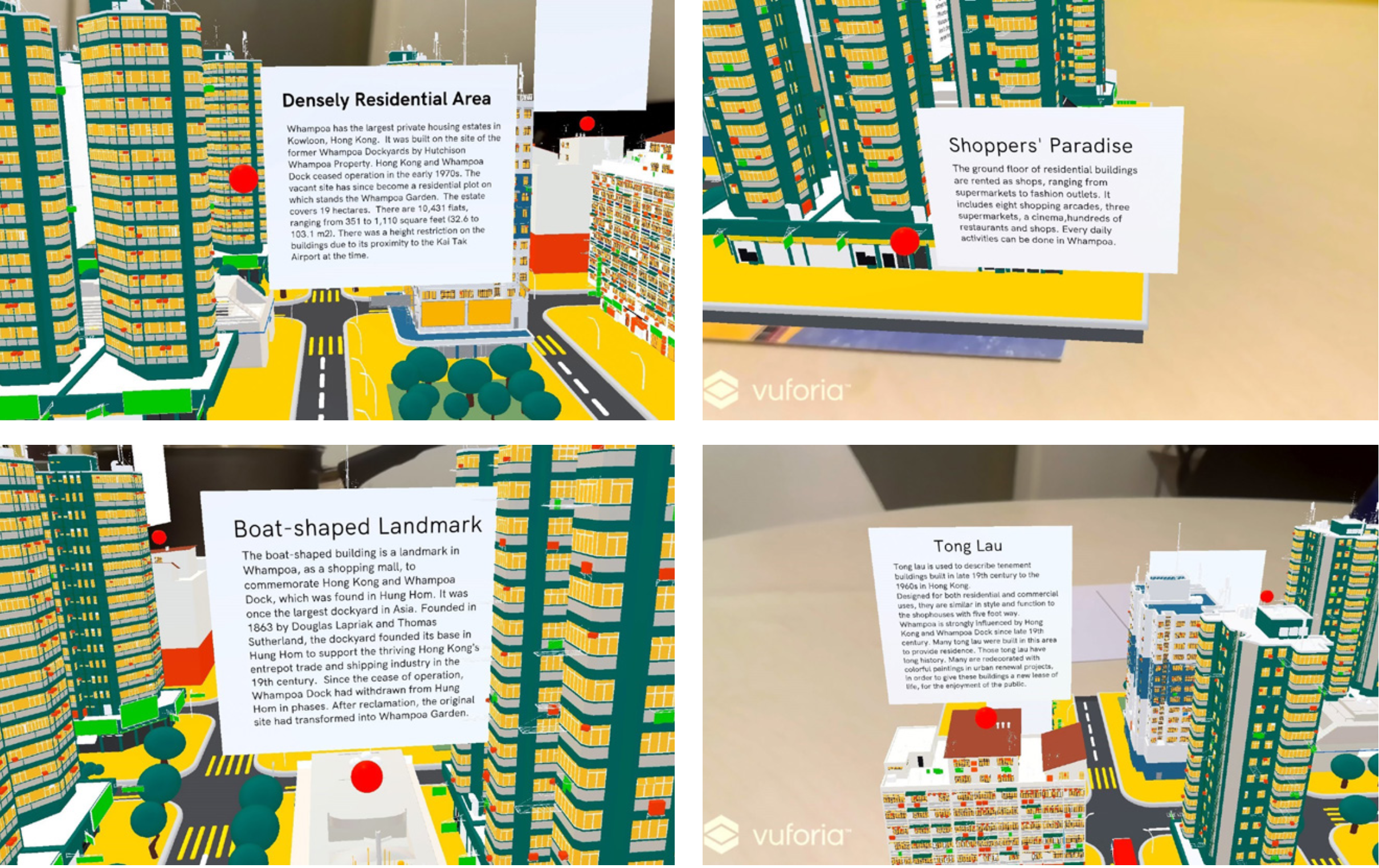
This is an interactive AR application. By scanning the postcard, digital graphics can be shown on the phone for communicating information to the audience. One of the postcards shows the 3D scene of Whampoa area can be shown. There are brief information about Whampoa, which introduces the characteristics and history of Whampoa.
When tourists get the postcard, they can get more information about Whampoa using innovative and interactive method.
While the AR application can engage audience.
Identity Design


Final Design


